Making de_dust2 in Blender - Part 1: Super Low Poly
February 24, 2020
This week, we're taking a look at one of the most iconic FPS maps of all time: the Counter Strike franchise's Dust II. It's been around for a really long time (think March 2001), and is set in sunny Morocco. I'm going to be laying out a low poly version of bombsite B, and this first video will go over the broad strokes of the map, defining the overall sense of scale and orientation of the scene. In a future video, I'll go over detailing and shading, but for now we're only looking at positioning and blocking-out the model.

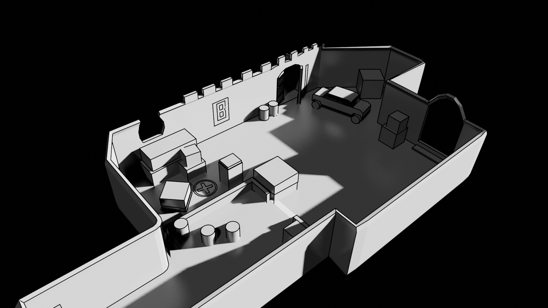
Here's a look at one angle.
Video Tutorial
Summary
Blocking out is a super important step, and precise layout of the blocked out mesh significantly affects how the final product will end up. It's like prototyping, and you should try to be fast and accurate, which is only really possible if you pick a good resolution, or level of detail to work at.
This model has only the basic components of the Dust II B-site, but it's already recognizable from the dimension of the walls and the placement of some props.
Now, there's not much to this, here are some interesting pointers to making de_dust2 in Blender, or really any other map.
Tips & Tricks to Map Modelling
- Use reference images! I recommend PureRef (https://www.pureref.com/) to manage them. It's free and super powerful, and much better than Blender's built in capabilities, though using background reference is also very important.
- Model the floor first using quads as much as possible, and then add displacement and walls by extruding the edges upwards. Using quads gives you a lot of flexibility with modelling and they're generally a lot easier to manipulate than Tris or Ngons. However, keep the floor flat otherwise you'll end up with non-planar surfaces which you'll have to split or retopologize later.
- Use the solidify modifier to add thickness to walls and floors. Don't extrude, as this creates more geometry that you can mess up easily.
- Work on the basic details first! Keep your resolution to roughly the same level as you go - don't put a high poly prop in your scene if it's got as many vertices as the rest of the scene combined! It'll look jarring and stick out.
- Create sharp shadows and high contrast with small (angled) lights. Using a smaller light source creates much sharper shadows and removes the blur around them, giving a more defined silhouette and deeper contrast.
- Use a fill light to colour in your shadows, but don't make it too bright, otherwise you'll lose that hard earned contrast.
- Use the EEVEE renderer for superior quicker render times. At the end, for a super high res raytraced render, you can switch to Cycles with some material reconfiguration, but for now, EEVEE is perfect for scene block outs.