Blender Robot Character Guide: Materials, Scene Setup (IV)
January 23, 2020
Welcome to the final part of our Blender Robot Character tutorial. We'll be going over how to create some photorealistic and stylized materials, decals, setting up the overall composition, and building a minimal environment to render our model.
This is the fourth, and final section of this tutorial series.
- Modelling I
- Rigging (Using IK)
- Modelling II (Details & Kitbashing)
- Materials and Environment Setup
Starting Resources
We'll be using a carbon fibre material to texture our robot. You'll need to download it from textures.com: CF Texture
Also, if you haven't been following the previous parts and just want to skip over to the materials and lighting part, you can download the free rigged basemesh here, the IK rigged robot built from the previous three tutorials:
Watch the Video!
The Materials
Carbon Fibre Material
This is the most complex material in the scene, which should tell you how simple the others are. Create a new material called "Carbon Fibre" and then give it this node setup.
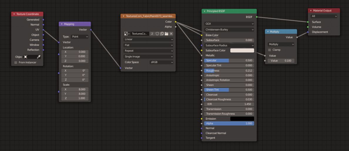
Add the carbon fibre texture into the image texture input (textures > image texture)
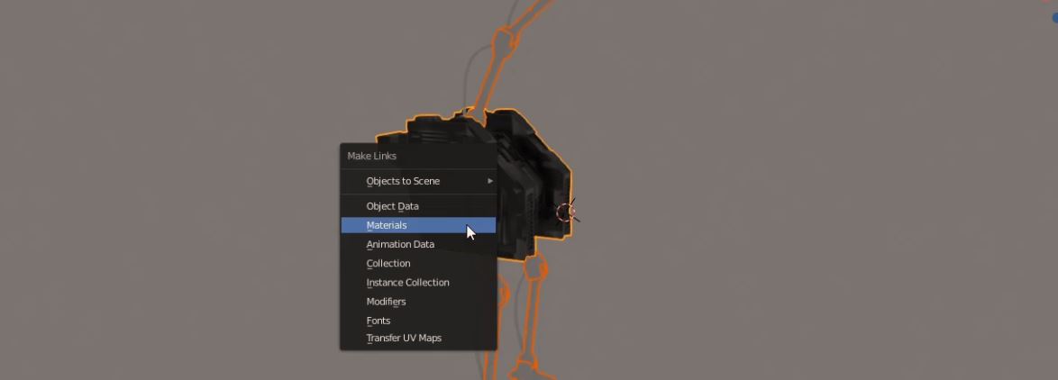
We'll be applying this material to the whole mesh, and we can select all the sections (except the cables) and then add this material to any section. With the active selection as the one with the carbon fibre material applied, hit Ctrl + L > Link Materials to give every object in the selection the same material.
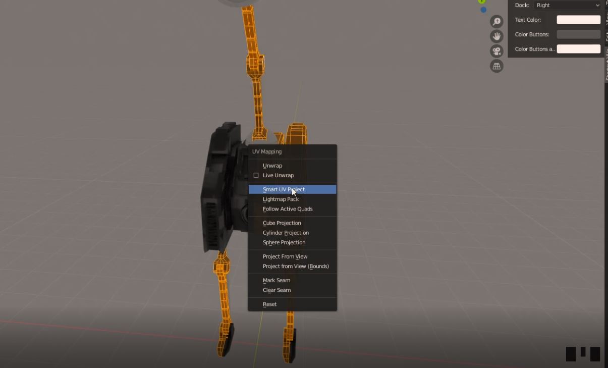
Then, we can see that the placement of the texture and its scaling is rather distorted. We can fix this by UV-unwrapping everything and then changing the mapping of the texture (basically scaling the texture "tiles" down, so that they're more densely packed and resemble carbon fibre more). In Blender 2.8, we can multi-edit several objects at once, so select all the objects with the carbon fibre material and go into edit mode with tab, then hit U > Smart UV Project (Don't change any settings!)
Then, we'll want to tweak the scaling on the XY plane by using a mapping node. Tweak this until it looks good to you, I used 8x scaling on both the X and Y axes. I suggest you use the same amount for both axes unless you want more distortion. Refer to the node group image for details.
We're adding roughness and bump-displacement using the image texture as reference (It's a bit lazy but looks good), and we can just plug in the image output into their respective inputs. Again, check out the node setup if you're not sure what I mean.
Lens Material
Selecting this part of our basemesh is going to be a bit difficult. You can double click on edge loops to select them, and I suggest you make use of the circle select (C to enter, esc to exit circle select mode) to select as many vertices you can at once.

This material is simply a dark, glossy/metallic material. The node setup only requires a single node (the wonderful principled shader), and it is very simple to make.
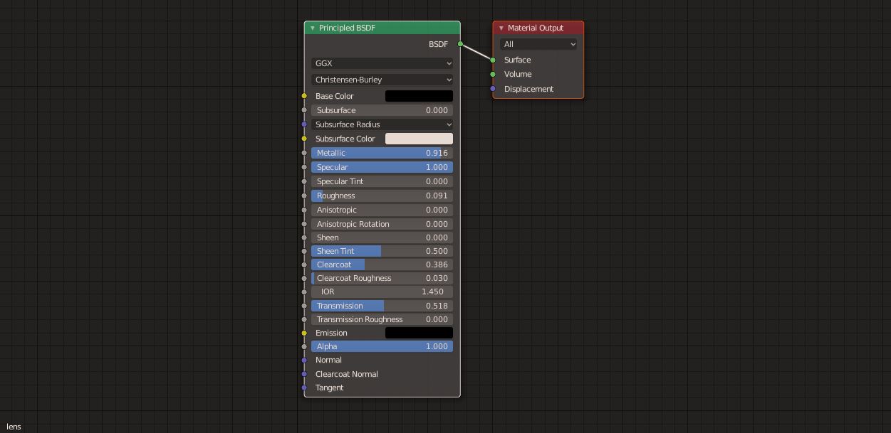
Be sure to apply the material to these selected faces in edit mode.
Glow-y Cables Material
With all the cables selected, we want to use the same material linking method to apply this material setup to the cables. The fresnel node captures the edges of a material (Technically I believe it smoothly captures the faces whose normal vectors are closest to being perpendicular to the camera ray) and we can exploit this to create a glowing edge or centre look, with a transparent body, similar to what you'd imagine fibre optic cables look like.
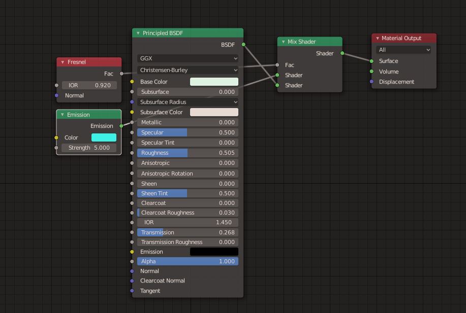
Here is the node group, fiddle with the IOR value to your heart's content! It changes the bending of light through the material and some math-y thresholds. If you set the emission strength to too high, it could overwhelm the interior, which would be bad. Also, "Transmission" in the Principled BSDF node is how much light is transmitted through the material, and in EEVEE this requires you to enable Alpha Blend in the material opacity settings, as EEVEE doesn't really support transparency. This is more suited for cycles work. Having a higher value makes our cables more glass-like, which is pretty cool.
Also, I'm going with an aqua/cyan + black colour scheme. You can change this to anything you wish, and I think orange or magenta would look pretty amazing too. Just make sure that you change the next material (accents) and the backdrop to have the same-ish colour.
Internal Accent Materials
The theme I've selected is to use anything that "cuts" into the mesh, like the vents or side plates, to shed an inner glowing light, as if there's a fusion reactor inside and the robot is glowing with its energy.
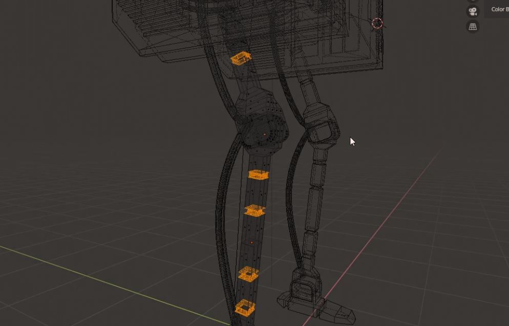
I'm talking about these parts. You can give these a simple blue emission shader or even the cable shader as an accent.
For a reference as to where the accents are, check out the final render:
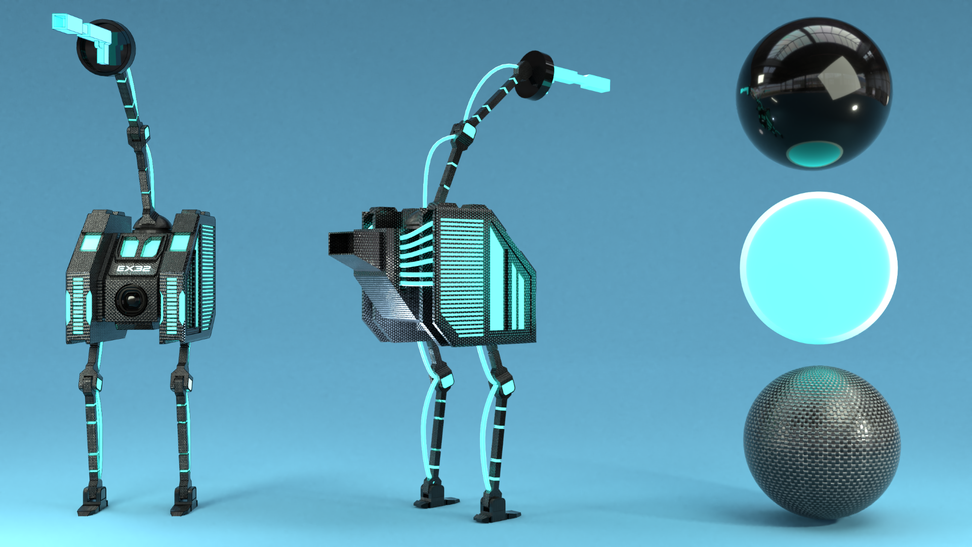
You can see that most of the exposed inside sections are glowing blue, as promised.
Decals (Shrinkwrap Modifier)
We'll be using the shrink wrap modifier and some simple text (with a nice font - Cyberfunk which you can get at the link, or anything else that you think looks good). Write your text and position it "over" the face we're projecting it on.
The shrinkwrap modifier, if you've never used it, does exactly what you'd expect it to do. It takes your text, or image, or anything flat, and projects it with some offset onto your mesh, making it match the orientation of the face, as if you were actually applying a sticker onto the mesh. This can be moved around, be be careful of the placement - if the decal and face are perpendicular, you'll get nothing but a straight line. Keep the offset small, as we just want to have the faces non-intersecting but very very close together.

You can give this the same materials as the cables, but you can also create your own text accent material, so have fun experimenting with what looks best.
Render Settings
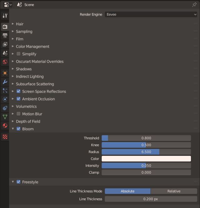
Make sure to turn on freestyle (lower the thickness), bloom (glow!) and screen space reflections (so objects are reflected rather than only the environment. I will assume you're rendering in EEVEE.
Lighting and Backdrop
One of Blender's cooler features is that we can turn of shadows from lights. We're going to be using all area lights of different sizes. We want to have a powerful and small key light in the center, with shadows enabled, to cast a strong profile and create those nice reflections in the lens and carbon fiber.
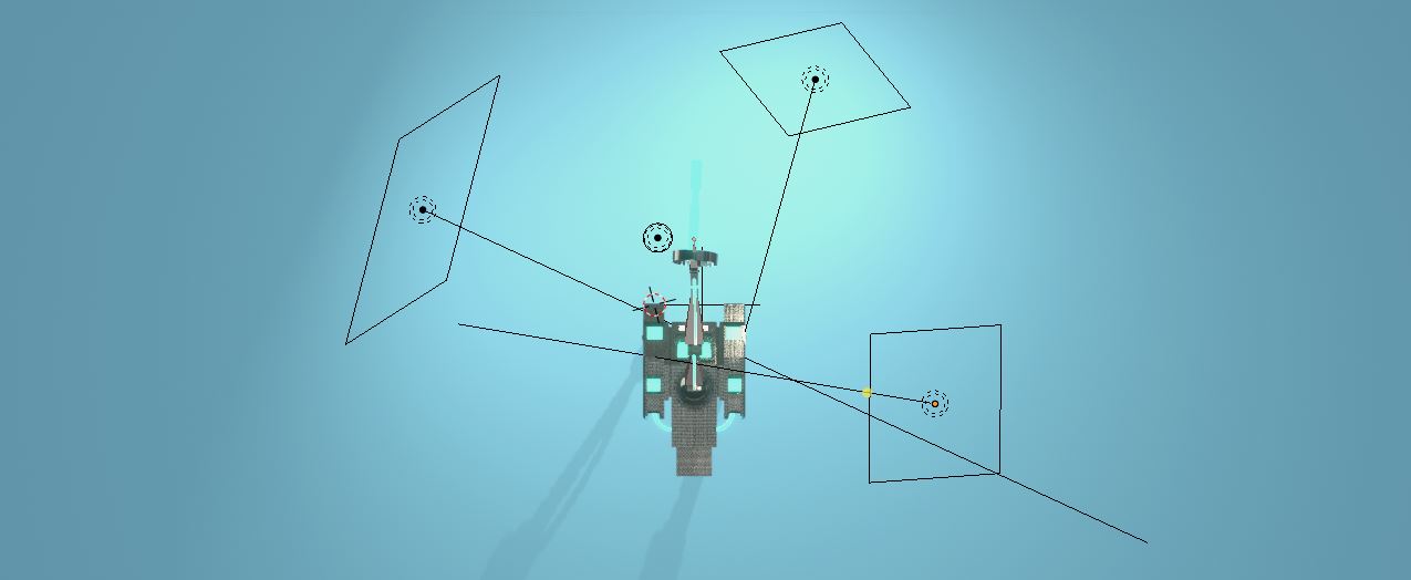
Then, we have two accent lights, one the left and right side with shadows disabled. These can be slightly tinted blue for a bit of dramatic effect. Depending on the scale of the scene, you might need to turn the power quite far up.

Shadowless accent light settings
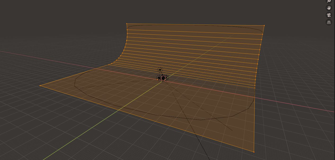
Our backdrop is a very large subdivided plane. We create a standard plane and extrude upwards at a 90 degree angle, then select the connecting edge and bevel with many segments to create a smooth backdrop like this. We can even apply subsurf and we need to add smooth shading.
One thing to note is the relative size of this to the scene - it must very big, otherwise you'll get reflections and bright horizontal lines in the corner, and across the screen, so it must be big enough that the lights do not reflect off it. It's a simple principled material with high roughness and a diffused periwinkle blue material.
Conclusion
That was a pretty long ride, but we've finally built a robot character from scratch! Congrats for finishing this series, and thanks for coming along with me all this way. I don't know if I'll be doing more series tutorials or just one-off quick scenes, but I'm leaning away from these series as they can get a bit dull to make.
One think we didn't get to do in this series is animate. I'll be honest, I'm a pretty terrible animator and I didn't think I should be trying to teach that. You may have noticed that the addition of cables is really not helping, as they don't move with the mesh, and you will have to either remove them or use a hook modifier and some creative rigging to fix this. Wayward Art Company has a pretty good tutorial about this, and if you're interested in animating this you should check it out.
Thank you again for being here and reading my tutorials! I hope you've enjoyed them, and if you have, you can check out my Youtube channel or the rest of this site for some more content!
Leave a comment if there's anything else you want to see me make, and let me know what you think! I always appreciate feedback!